A color can look perfect on the hanger and strangely flat once it’s under your face. Another shade you’d never have picked might make an ordinary shirt the one you wear every week. Fashion color analysis is a way to notice those differences—and use them when choosing clothes. It’s most helpful when it gives you better options, not a list of colors you’re forbidden to wear.
The practical question isn’t “What season am I?” It’s “What happens when I put this color on?” Look at the color next to your face, then look at how it works with the rest of your wardrobe. Those are related decisions, but they aren’t the same one.
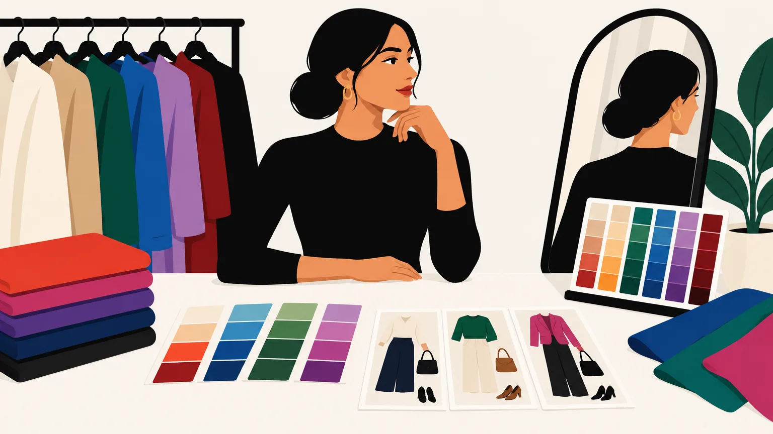
What color analysis can—and can’t—tell you
Personal color analysis compares clothing colors with your coloring: skin, hair, eyes, and the contrast among them. It often considers three qualities of a color: temperature (how warm or cool it looks), depth (how light or dark it is), and intensity (how clear or muted it is).
You don’t need to pin down all three before you get dressed. They’re useful because they help explain why two shirts that are both “blue” can behave so differently. A pale, gray-blue blouse and a vivid cobalt sweater will create different effects near your face and call for different outfit partners.
Think of analysis as a fitting-room tool, not a diagnosis. A color may look especially good beside your face; another may be easier to wear as pants, shoes, or a bag. And a color you love can still belong in your closet even if it fails someone else’s test.
Start with undertones, but don’t let them run the show
In styling, undertone usually means the warm, cool, or less clearly one-sided quality you see in someone’s coloring. Warm clothing colors often have a yellow, golden, or orange lean; cool ones may lean blue or blue-violet. Compare cream with stark white, or rust with raspberry, and the distinction becomes easier to see.
Skin depth and undertone are separate questions. Light skin isn’t automatically cool, and deep skin isn’t automatically warm. Human skin color varies within groups and across areas of the body; measured skin colors from different ethnic groups overlap substantially. That’s one reason a photograph—or a rule based on hair color or ethnicity—can’t tell you which clothes will look best on you.
The quickest useful test is comparative. Hold two garments of similar depth beside your face, one warmer and one cooler: for example, ivory and bright white, or tomato red and a blue-leaning red. Keep everything else as consistent as you can. Does one look connected to your face while the other seems to sit apart from it? Do you prefer the effect, even after the novelty of the color wears off?
Don’t expect every comparison to deliver a verdict. You might like both, or find that depth matters more to you than temperature. That’s valuable information. Jewelry and wrist-vein tests can be tempting shortcuts, but actual garments tell you much more about how you’ll wear a color.
Contrast may matter more than warm versus cool
Contrast is the difference between light and dark areas. If your hair and brows are much darker than your skin, a light top under a dark jacket may echo that contrast. If your coloring has less light-dark variation, a softer combination may feel more balanced. Neither effect is inherently better; the choice is about where you want the eye to go.
Try on a black-and-white outfit, then replace one piece with charcoal, cream, or a medium gray. Notice whether the sharp contrast makes you look more defined or whether the gentler version puts the focus back on your face. Color matters here, but so does the size of each area. A narrow white collar against a dark sweater is a different proposition from a large white coat over black pants.
Intensity deserves its own test. Bright fuchsia and dusty rose may have a similar general hue, yet one demands attention while the other settles into an outfit. If vivid colors feel too forceful across a whole jacket, try them in a scarf or a small print. If muted colors leave an outfit dull, add one clean, brighter note rather than replacing everything.
Run a fair test with clothes you already own
You can learn a great deal without buying swatches or booking a consultation. Gather several tops, scarves, or pieces of fabric that differ clearly in color. Include something you wear often and at least one shade you suspect won’t work. Avoid comparing a favorite, beautifully cut shirt with an awkward garment you already dislike; the fit will influence your answer.
Stand near a window in steady daylight, away from direct sun. Turn off strongly colored indoor lights and use the same mirror for each comparison. Lighting changes how skin color is perceived, so consistency matters more than finding a supposedly perfect light. Hold each color just under your chin, covering as much of the previous one as possible, and switch back and forth.
Ask yourself three questions:
- Where does my eye go first—to my face or to the fabric?
- Do I like the amount of contrast the color creates?
- Would I enjoy wearing this shade in a real outfit?
Look at your whole face rather than hunting for a single sign, such as a shadow under your eyes. You’re making a style judgment, not proving a scientific result. A photograph can help you compare options later, but camera settings and screens may shift colors, so make your first call in the mirror.
Once you’ve found a promising color, test it in an outfit. A scarf held under your chin can tell you about color placement, but it can’t tell you whether you’ll enjoy a full-length coat in the same shade. This second step keeps a flattering color from becoming an impractical purchase.
Choose colors that work with each other
A wardrobe palette is useful when it makes getting dressed easier. Start with two or three neutrals you genuinely wear, then add a few colors you like beside your face. Your neutrals don’t have to be black, white, and gray: navy, chocolate, olive, cream, and soft brown can all fill that role. The important thing is that your main pieces make several outfits together.
When a combination feels wrong, check these three things before declaring the colors incompatible:
- Depth: Is one color very dark and the other very light? That sharp division may be exactly what you want—or the reason the outfit feels chopped up.
- Intensity: Is one piece vivid and the other muted? Let the vivid piece lead, then keep the rest quieter.
- Temperature: Do the shades seem to share a warm or cool lean? They needn’t match, but repeating a temperature elsewhere can make a deliberate contrast feel connected.
Color-wheel relationships can give you ideas, not orders. Neighboring colors create an analogous combination, while colors opposite each other create a complementary one. In clothes, the softened versions are often easier to use: a sage shirt with olive pants, or navy with a small orange accent, rather than two equally loud blocks of color.
Repetition also helps. A burgundy stripe in a shirt can connect with burgundy socks or a bag; a cream shoe can pick up the cream in a patterned skirt. The Museum at FIT’s guide to fashion design principles describes how repeated color can lead the eye through a look. You don’t need an exact match. A visible family resemblance is often enough.
Before adding a new statement piece to your closet, make three outfits with it using clothes you own. If a teal jacket works only with the trousers you’re wearing in the store, think twice. If it works over your usual jeans, beside your favorite brown pants, and with a printed shirt you already own, it has a better chance of earning its space.
Use seasonal palettes as suggestions, not identity cards
Seasonal color analysis groups people into palettes with names such as spring, summer, autumn, and winter. Those categories can introduce useful distinctions: clear versus muted, light versus deep, warm versus cool. They become less useful when the label matters more than what you see in the mirror.
Real wardrobes also have purposes that a seasonal chart can’t settle. You may want a sharp black suit, a soft pastel dress, or a bright team-color sweatshirt. Wear them. If a shade feels difficult beside your face, move it farther away, break it up with a collar or scarf, or pair it with a color you know you enjoy. Placement gives you options that a “yes” or “no” palette misses.
The best personal palette is one you can recognize in your own closet. Keep a note of the specific shades you reach for—not just “green,” but “dark pine green” or “soft gray-green.” Test new colors against those favorites and against your actual clothes. If the outfit works and you feel like yourself in it, that’s a stronger answer than a seasonal label.